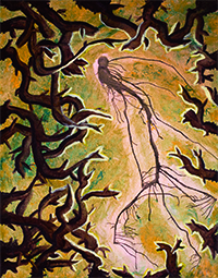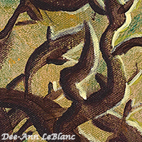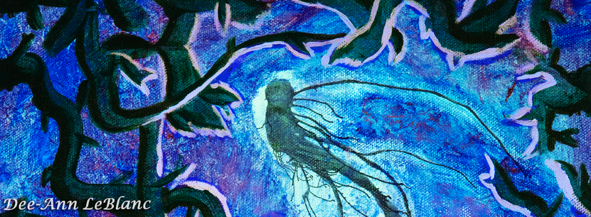
Along with making patterns, my other favorite digital technique is making color variations, both of my patterns and my paintings. These variations can be fairly straightforward color-themed shifts, or they can involve more complex effects and alterations beyond simple color. The simpler changes you can see in part of my Forest Spirit variation series, where I’ve shifted the colors according to the elements. The air piece among those variations, though, involved more complex adjustments since flipping it to a negative threatened to drown out any detail in the environment. You can see a sample set below, for the full set of variants see the Forest Spirit variations link earlier.


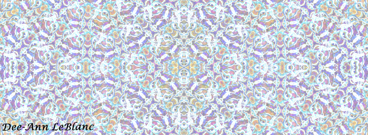
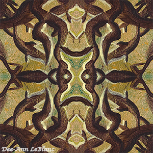
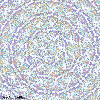
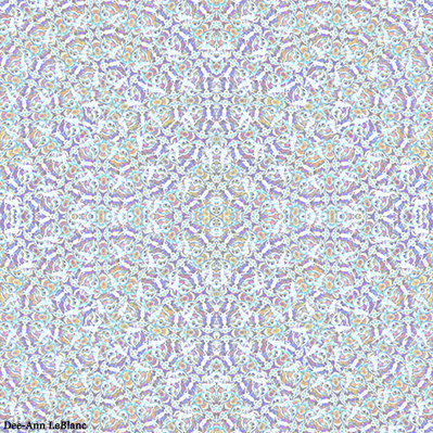
Some of the transformations are more involved, especially for patterns. I’ll use everything from color inversions, color overlays, pattern overlays, and more until I get something I like and that I feel will look good on products. Honestly, I think I’ll play with every aspect of Photoshop in the process! See my digital pattern Kaleidescape to see a breakdown of how it, in particular, evolved.
If anyone has relevant questions, please leave them in the comments and I’ll do my best to answer.